IBM Cognos 10 Bullet Charts
Cognos 10 marks a significant improvement in a new charting engine. Charts are without a doubt, a very powerful tool to deliver information. The chart enhancements made in IBM Cognos 10 focus on improving the effectiveness of this communication. This article discusses the Bullet Chart.
What Are IBM Cognos 10 Bullet Charts?
Bullet charts are variation of bar charts. They compare a featured measure to a targeted measure. A bullet chart features a single primary measure, such as current revenue. It compares that measure to one or more other measures, such as the target or planned revenue, and displays it in the context of a qualitative range of performance, such as poor, satisfactory, or good.
A Bullet Chart Contains:
- A bullet measure, which appears by default as a blue bar in the chart.
- A target measure, which appears as a dash in the chart.
- The color ranges, which help to describe the qualitative state of the featured measure.
- Labels identifying measures and numeric scale.
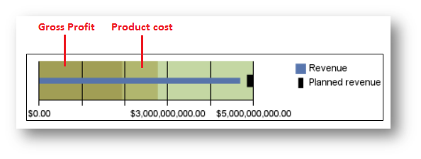
Let’s take a look at the below chart. The blue bar indicates the actual revenue of a company and the short black bullet indicates the planned revenue. Colored backgrounds signify the qualitative aspect of the measure ‘revenue’. We can customize these colors and the ranges as per end user requirements.
They can be defined with respect to:
- Percent on axis
- Any numeric value
- Mean
- Percentile
- Statistical maximum
- Statistical minimum
- Query Calculation
- Layout Calculation
Calculations in Bullet Charts
In the diagram below, the colored backgrounds have been defined according to query calculations. This way we can add even more data and value to this simple and concise chart. This single chart can help us compare measures as well as display additional information.
Bullet charts can also be designed in groups: We can have numerous bullet charts comparing a single measure across a dimension. The diagram below shows a bullet chart describing the qualitative state of revenue with respect to planned revenue, gross profit and production cost for different product lines.
Advantages of bullet charts
- The layout communicates concisely in an easily digested format.
- Bullet Charts are a great alternative to gauge charts.
- The consumer can view the state of metrics against multiple areas of interest.
This is a great new tool in Cognos 10 for companies to enhance their dashboards, supplement their existing charting or replace some of their existing charts. If you have any further questions surrounding bullet charts or creating meaningful and clear dashboards, do not hesitate to contact us at the Ironside Group.


